So recently, in case you haven’t noticed, have been taking a break from lith printing (though there is another ModernLith progress update queued up to eventually be finished). In the meantime, I’ve been doing a few different things. Over on Photrio I posted a test with processing some relatively well preserved 4x5 Anscochrome in a low temp C-41 process. That is exciting for me, but I don’t imagine many people have access to such well preserved color film from the 60s for that to really be useful. Otherwise though, the more relevant thing for the common person is that I’ve been working on a new film developer, EXG3, yet another extra strange “forever shelf life” glycin developer. For reference, these are what the characteristics are for each developer thus far:
EXG1 — Extremely simple 3 ingredient formula. Characteristics include full speed, moderate contrast, some highlight compensation, and extreme sharpness at the cost of some films (especially slow ones, oddly) coming out quite grainy. It works extremely well for pushing and gives good, though grainy, results with many different tested films. Test prints from these negatives sometimes can be difficult to extract all of the highlight detail from, indicating that scale may be a bit too long at least at the density level I use.
EXG2 — A simple single solution phenidone+glycin developer. A slightly lower contrast developer exhibiting full speed, moderate grain levels, good sharpness, and extremely compensated highlights. Test negatives were extremely easy to print at grade 2.5 despite what looks like somewhat thin density. It has a very nice smoothing effect on highlight detail. I’ve only really tested with FP4+ though. It is not suitable for pushing due to tendency to have fogging with extended development times.
EXG3 — What we’re discussing here. Still in progress, but current progress is toward extreme sharpness, raised contrast, and minimally compensated highlights. The primary purpose is to make sharp and “long scale” negatives that would be difficult to print normally, but ideal for the extreme contrast control that lith printing allows. Full speed is also a requirement and making it pushable would be nice.
The prototype v1 has more highlight compensation and lower contrast and incurs a 1 stop speed decrease with FP4+ (note: this may be due to camera fault in testing) but is otherwise ideal for Ilford Ortho 80. The formula is below:
to 1L of water
20ml of TEA (triethanolamine, 99% clear grade)
1g glycin
1g ascorbic acid
15ml of propylene glycol (optional, expected to be used in the final stock solution formulation)
10ml of 0.001% potassium iodide solution
0.05g potassium bromide (I used 0.5ml of a 10% solution)
0.8g sodium sulfite
4g potassium carbonate, anhydrous
The prototype v2 is much more contrasty and with very little highlight compensation. It can be quite finicky with exposure due to tendency for highlights to become rather dense with over exposure. Some minor edge effects occur on some films (especially Ilford Pan 400 of all films). Exhibits somewhat fine grain and only slightly raised contrast with T-Max 400, but with everything else tested has moderate or coarse grain and considerably heightened contrast. Seems to be full speed and with some pushing potential. An especially “brilliant” developer with increased highlight contrast, if exposure is correct.
To 1L of water
15ml of TEA
1g glycin
1.5g ascorbic acid
10ml of propylene glycol
10ml of 0.001% potassium iodide solution
0.4g sodium sulfite
5g potassium carbonate
0.5g potassium oxalate (experimental. May not be required)
As is obvious, the design of EXG3 is considerably more complicated than EXG1 or EXG2. Most sharpness and high definition focused developers include a lot of highlight compensation and I wanted to challenge that norm.
Prototype v1 examples
FP4+
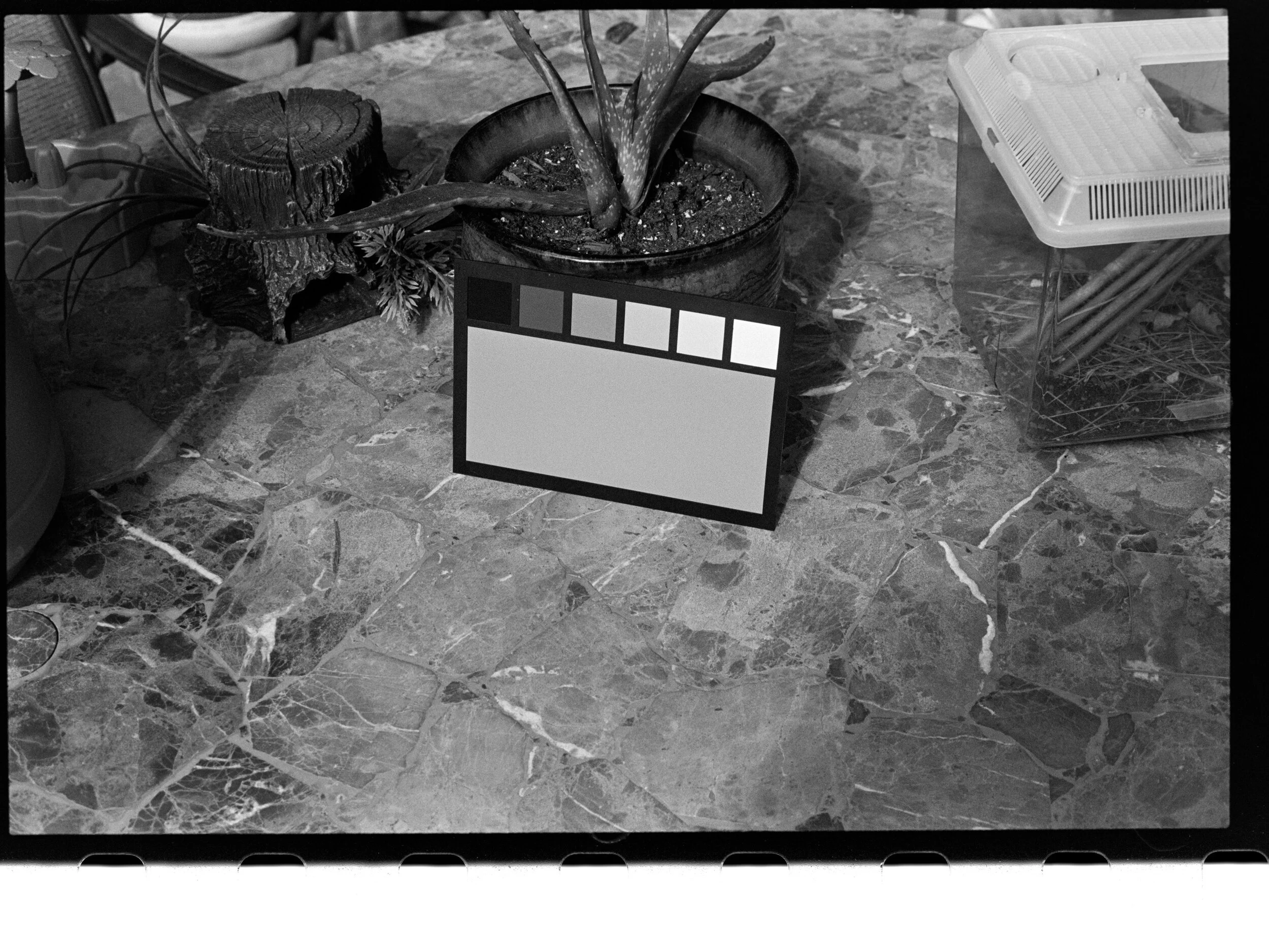
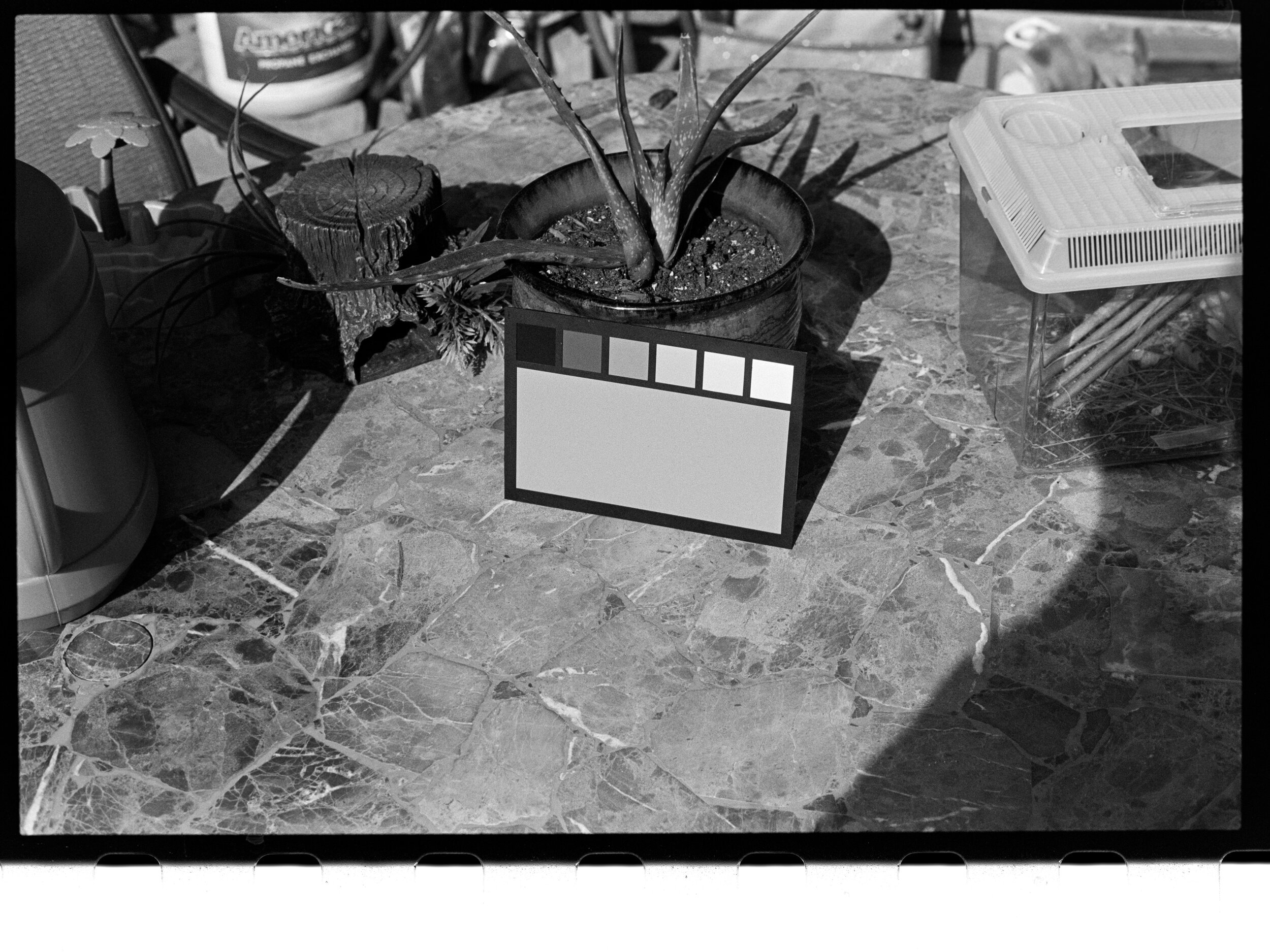
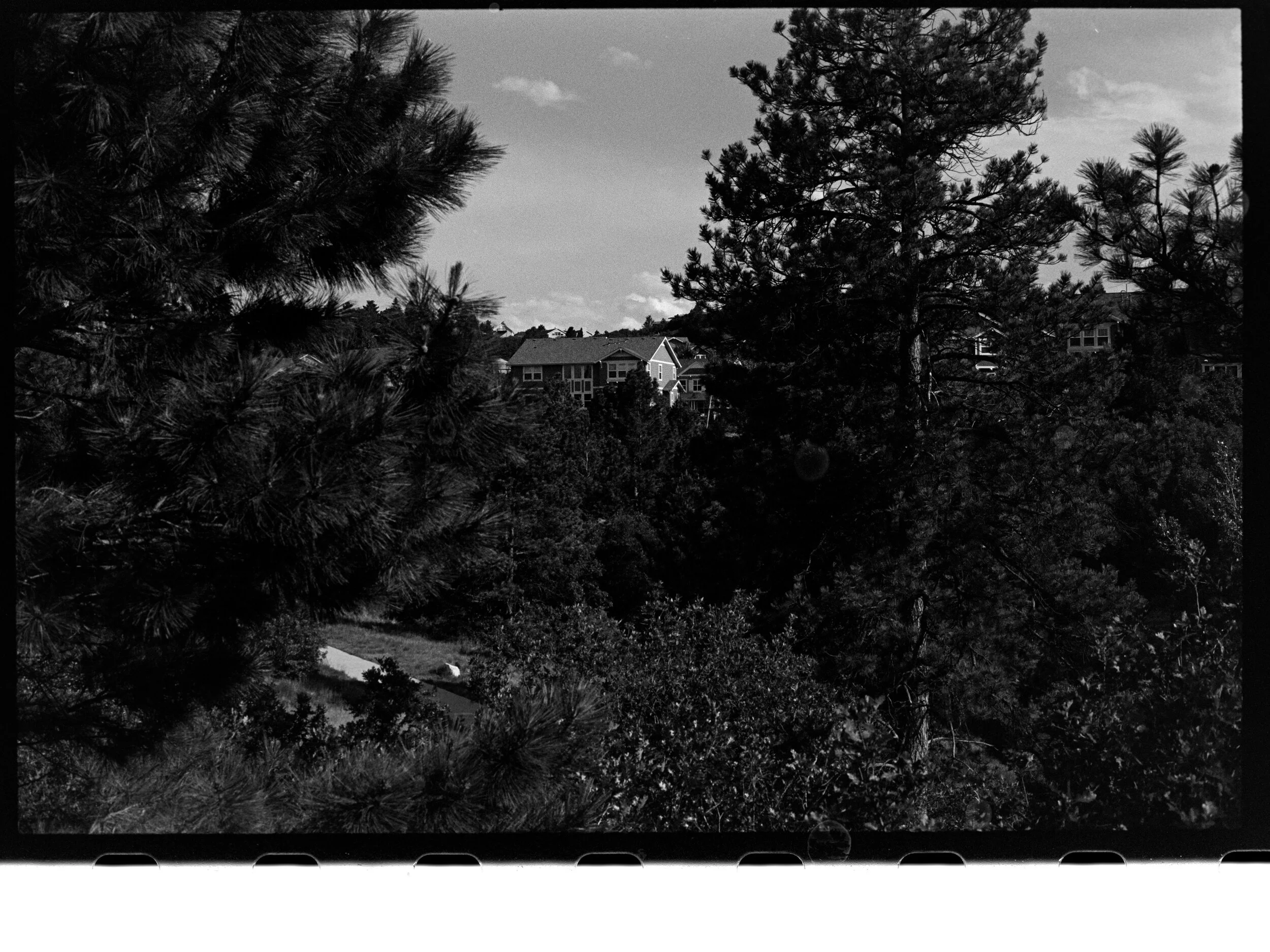
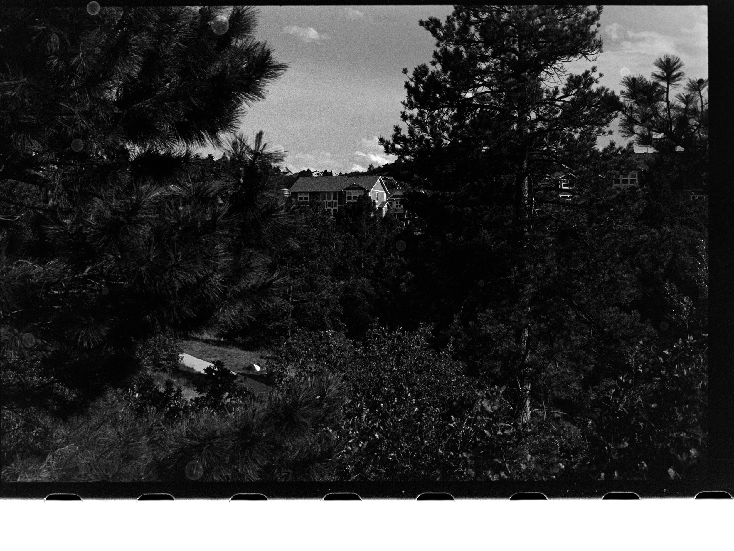
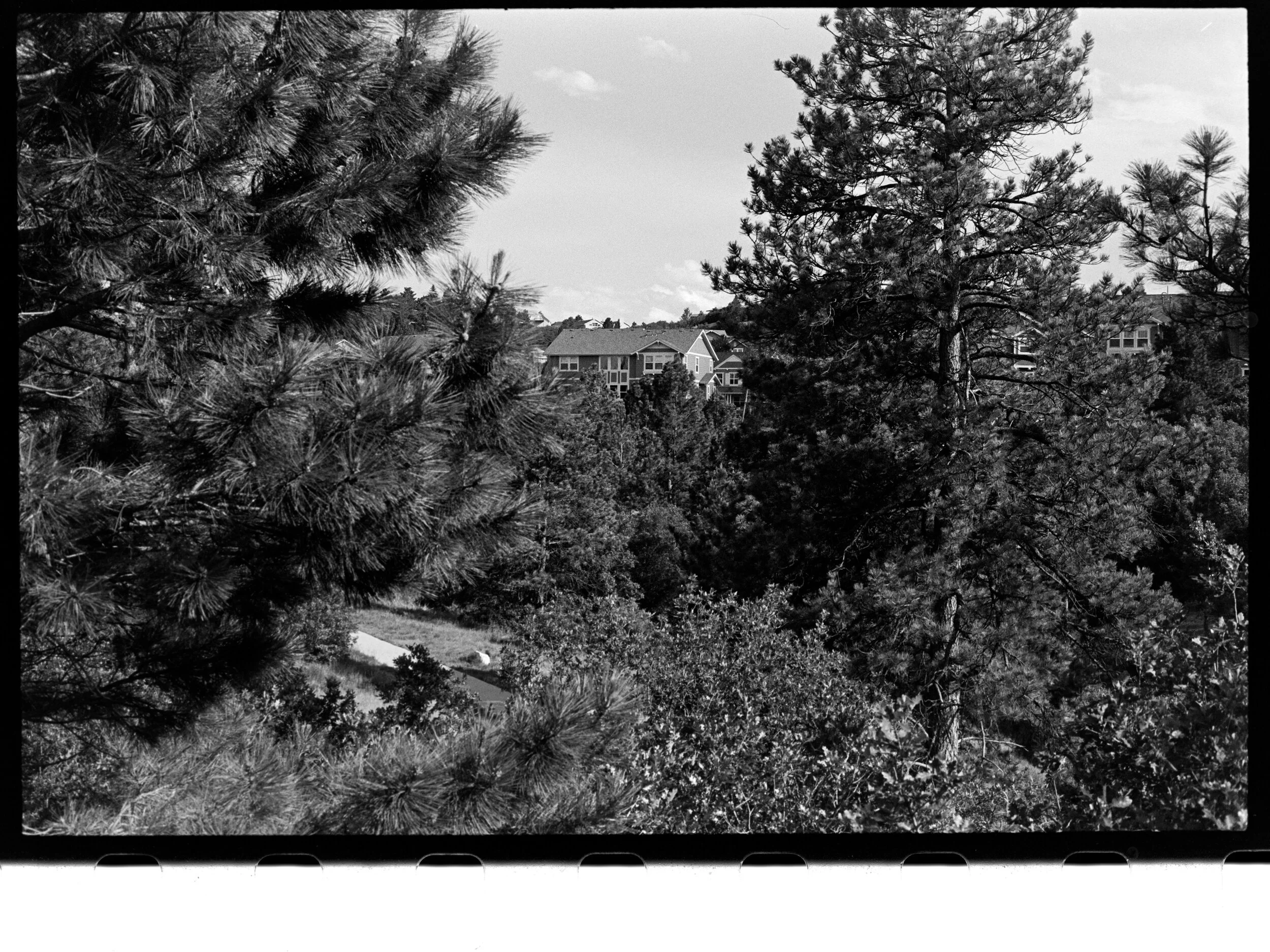
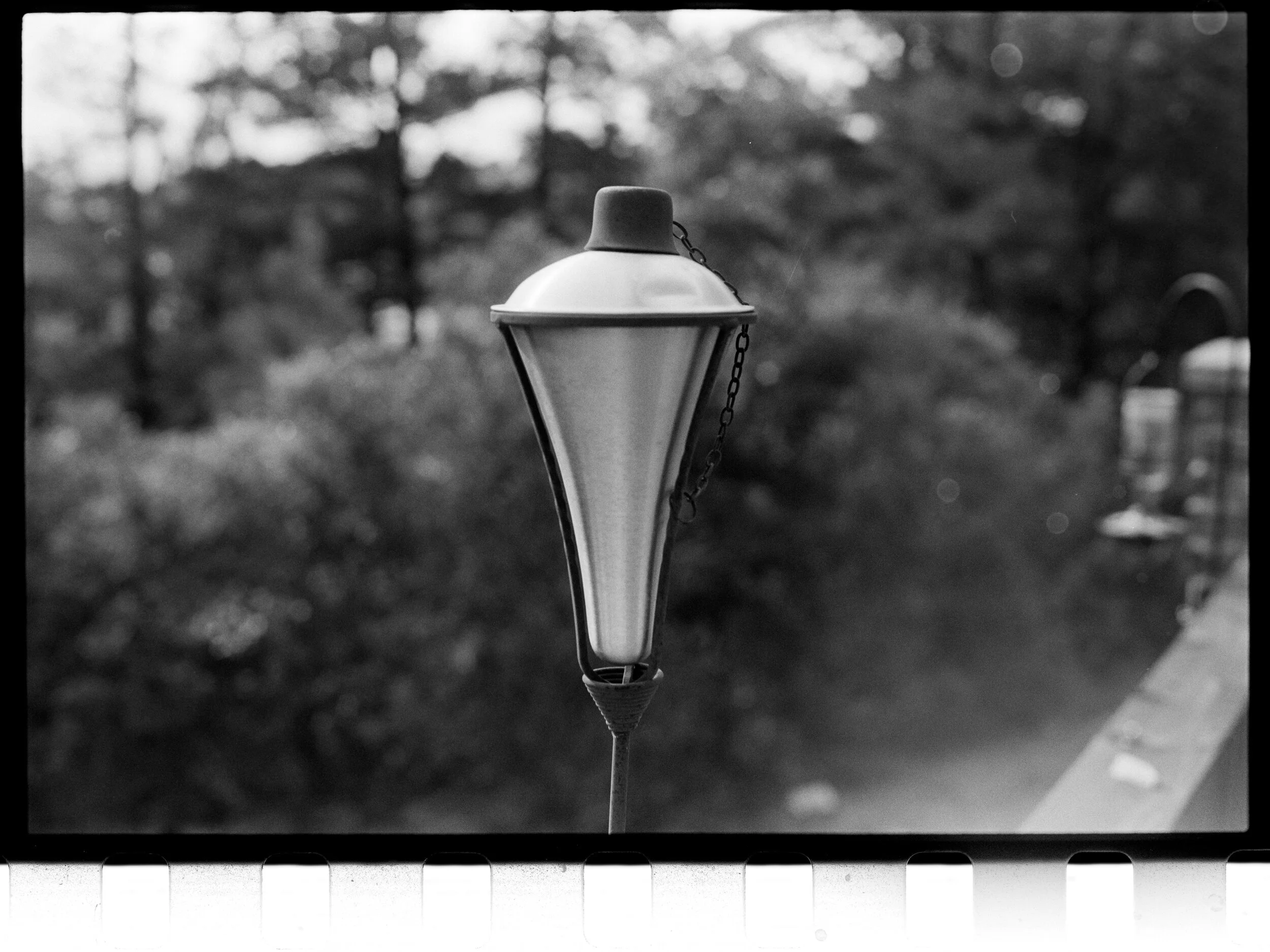
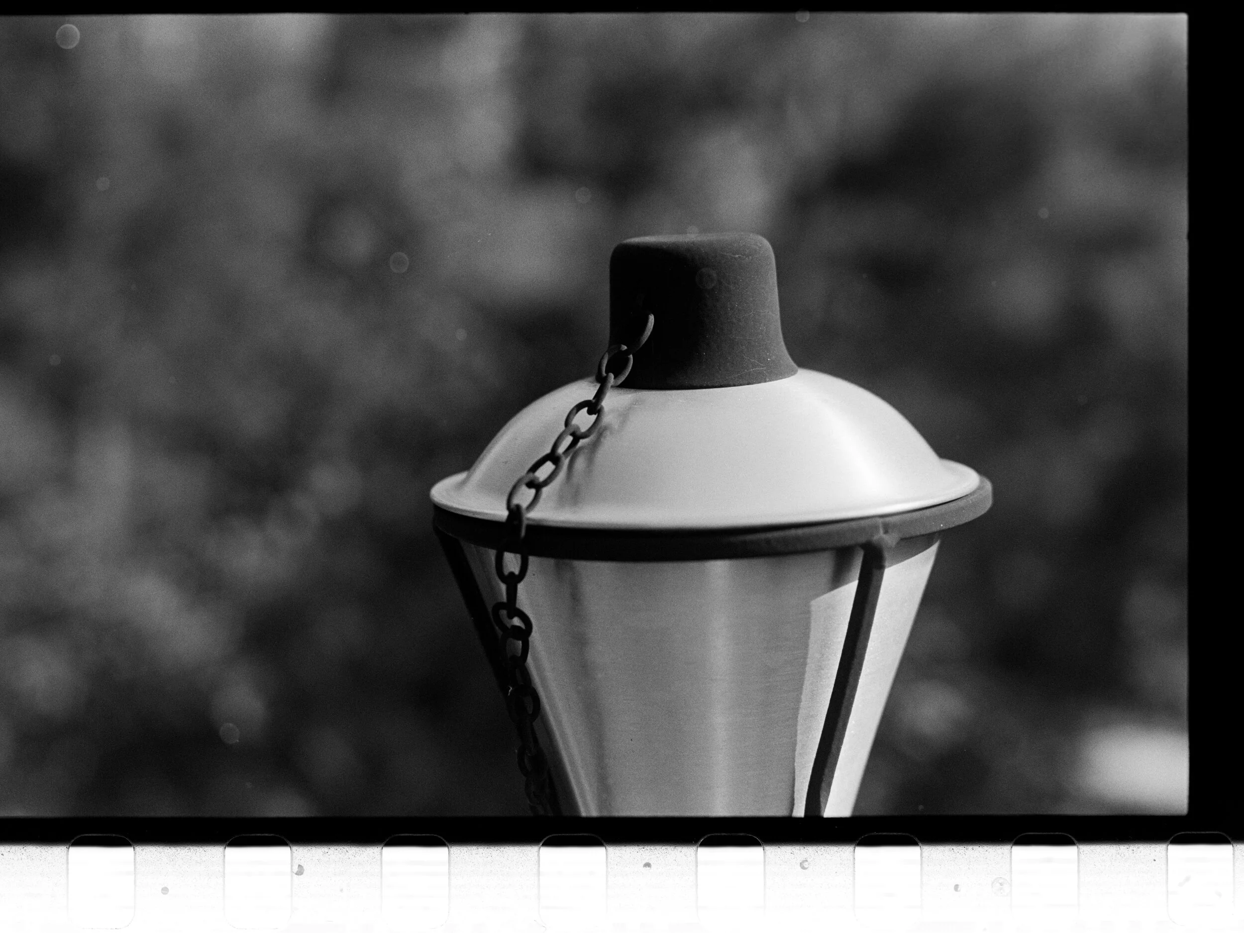
Ilford Ortho Plus 80
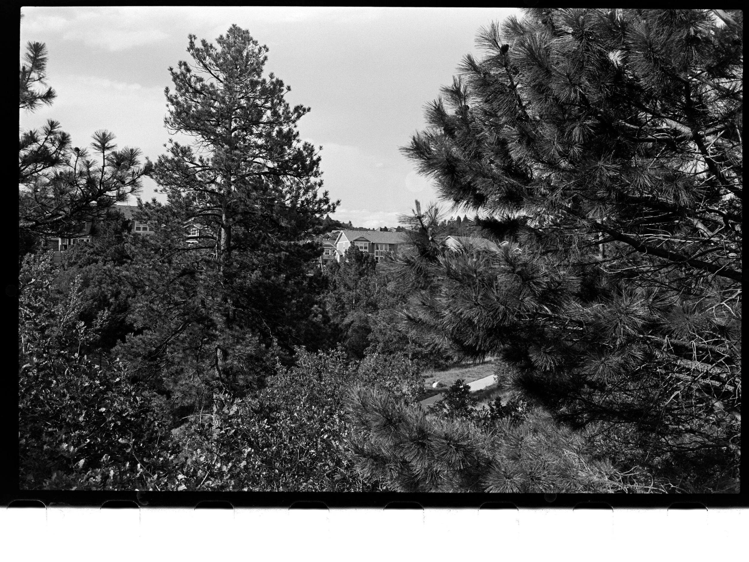
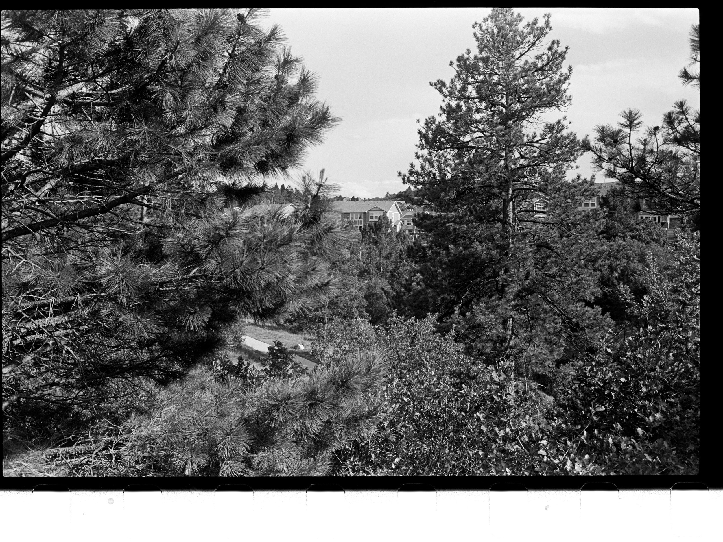
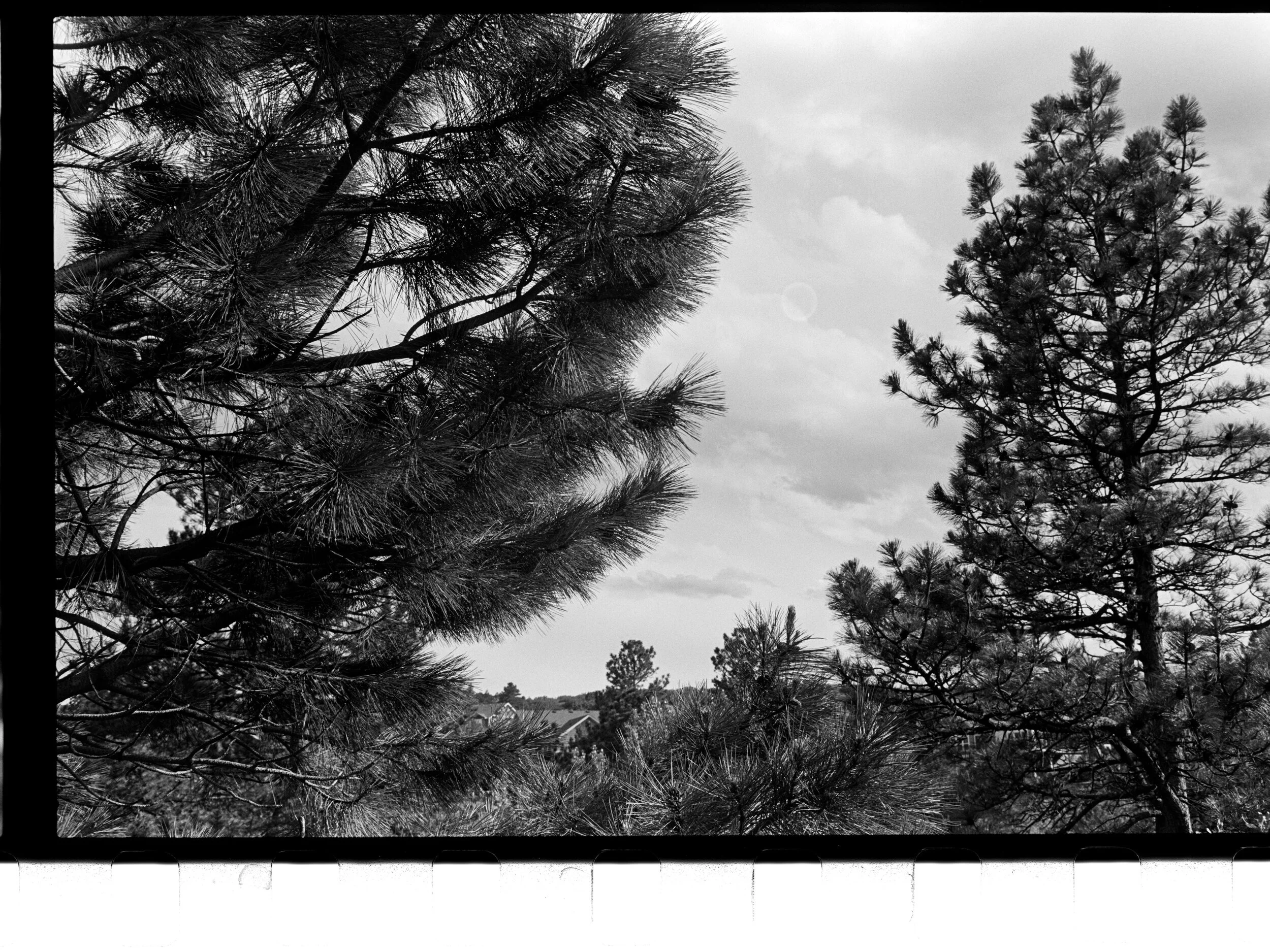
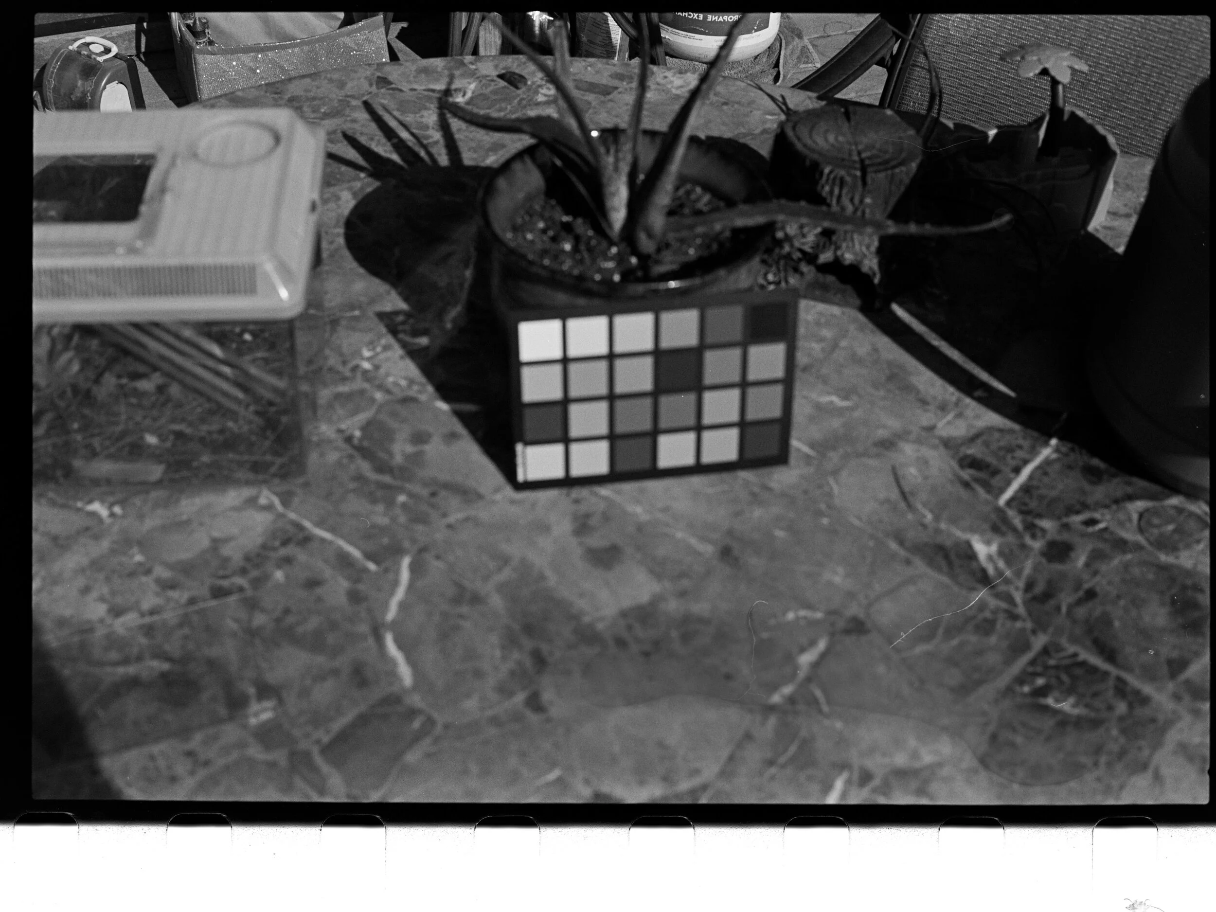
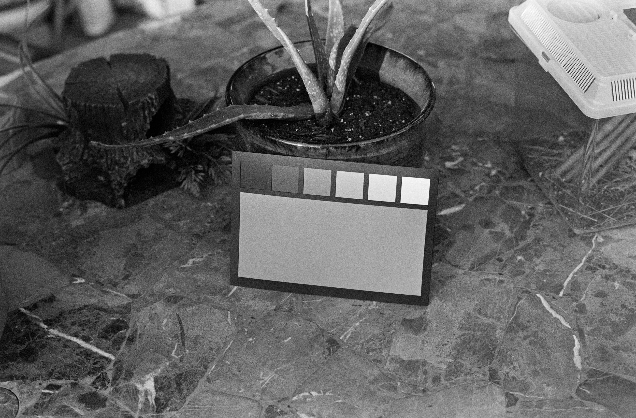
Prototype v2 examples
Note: all scans were scanned using DSLR auto exposure with no compensation and then processed by setting black point/white point to barely clipping within the image area. Most of these images occupied significantly more of the digital histogram than typical negatives, indicating longer scale that would likely make them difficult to print without losing some detail using traditional techniques
Arista.EDU Ultra 100:

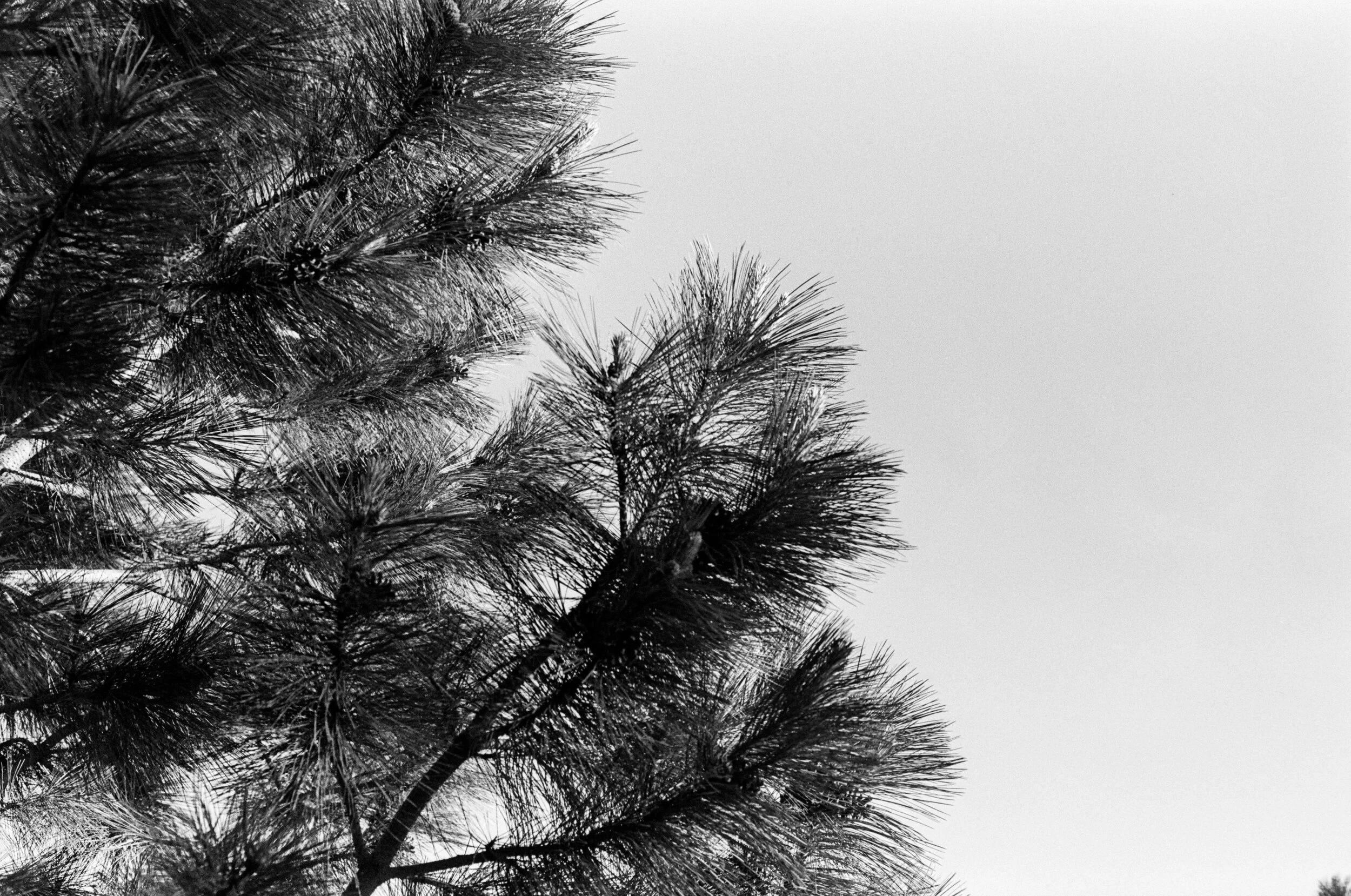
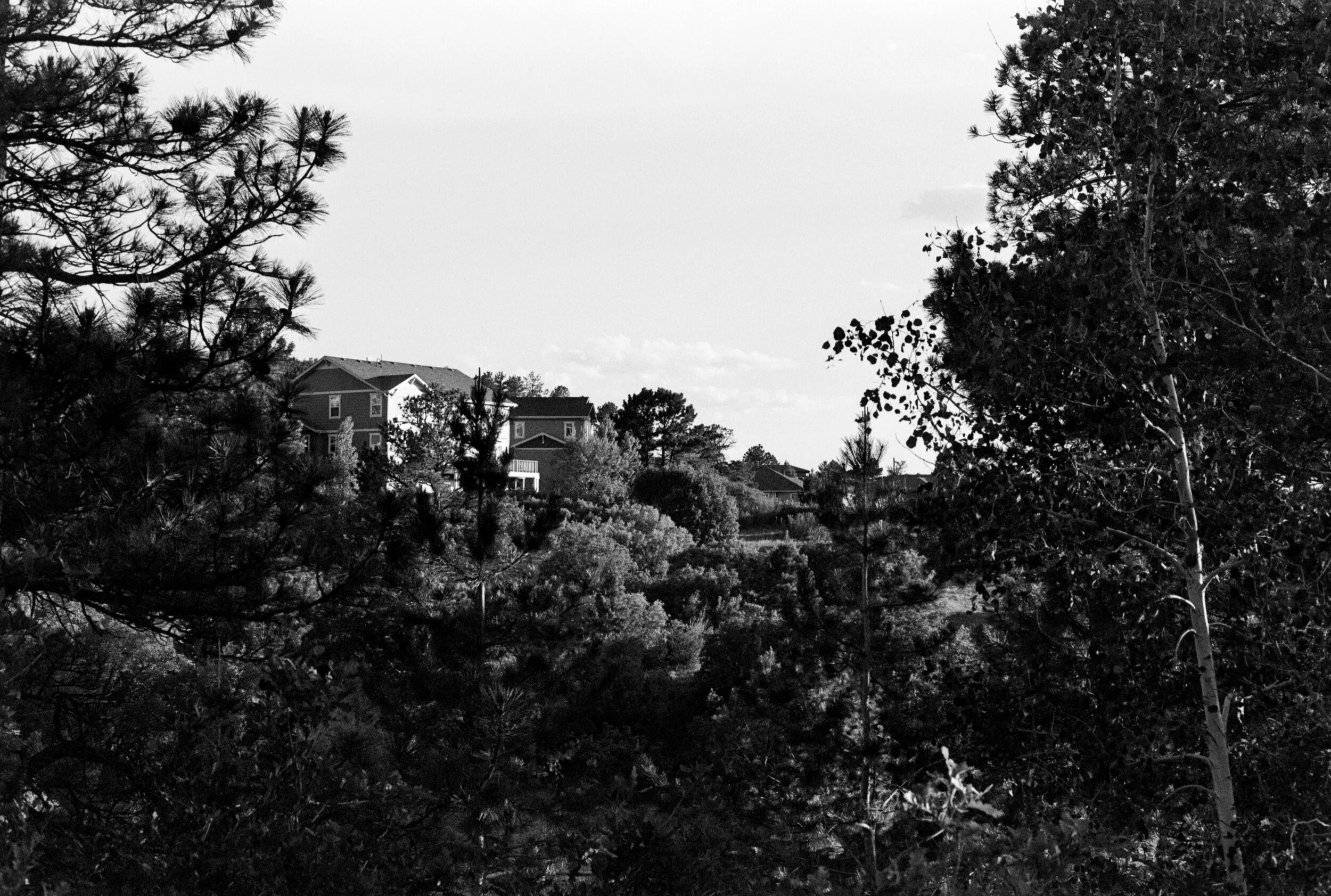
FP4+ (note, this may have been metered a bit wrong to give ~1/2 stop over exposure other than the test chart picture)
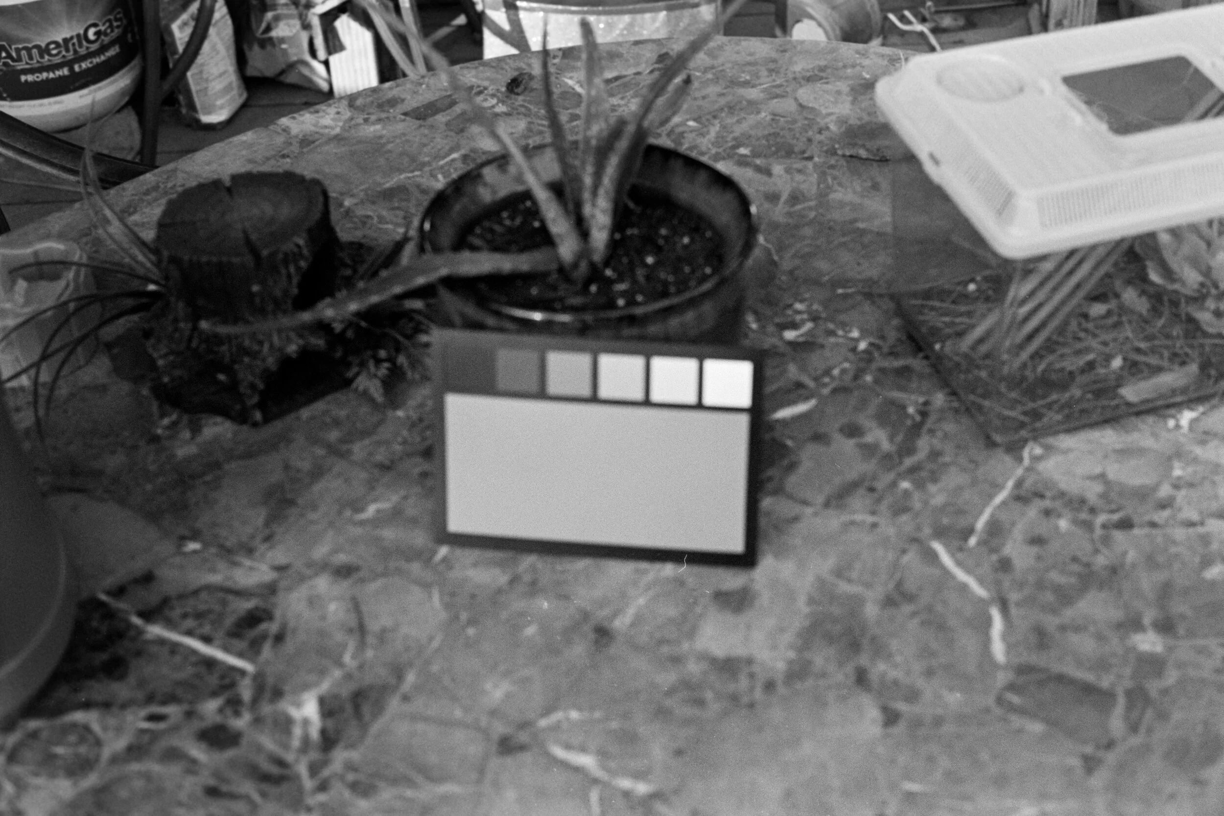

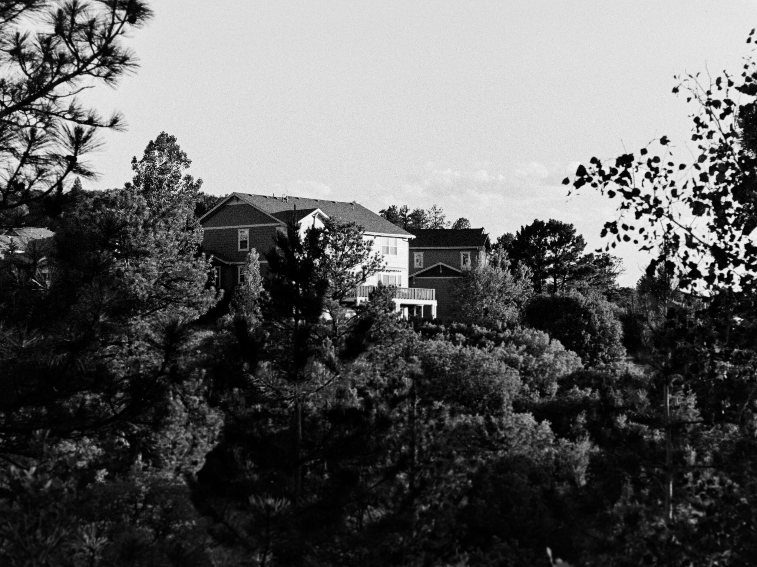
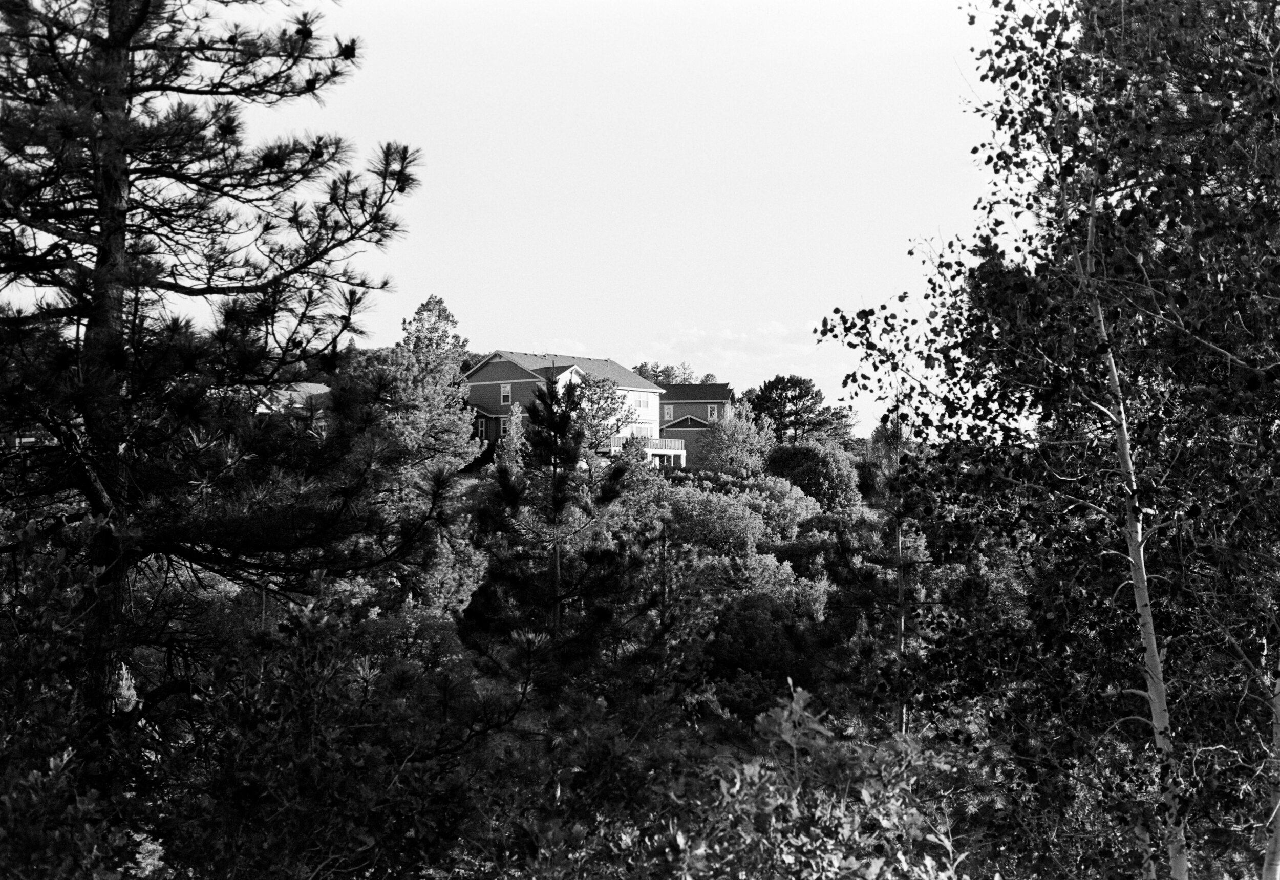
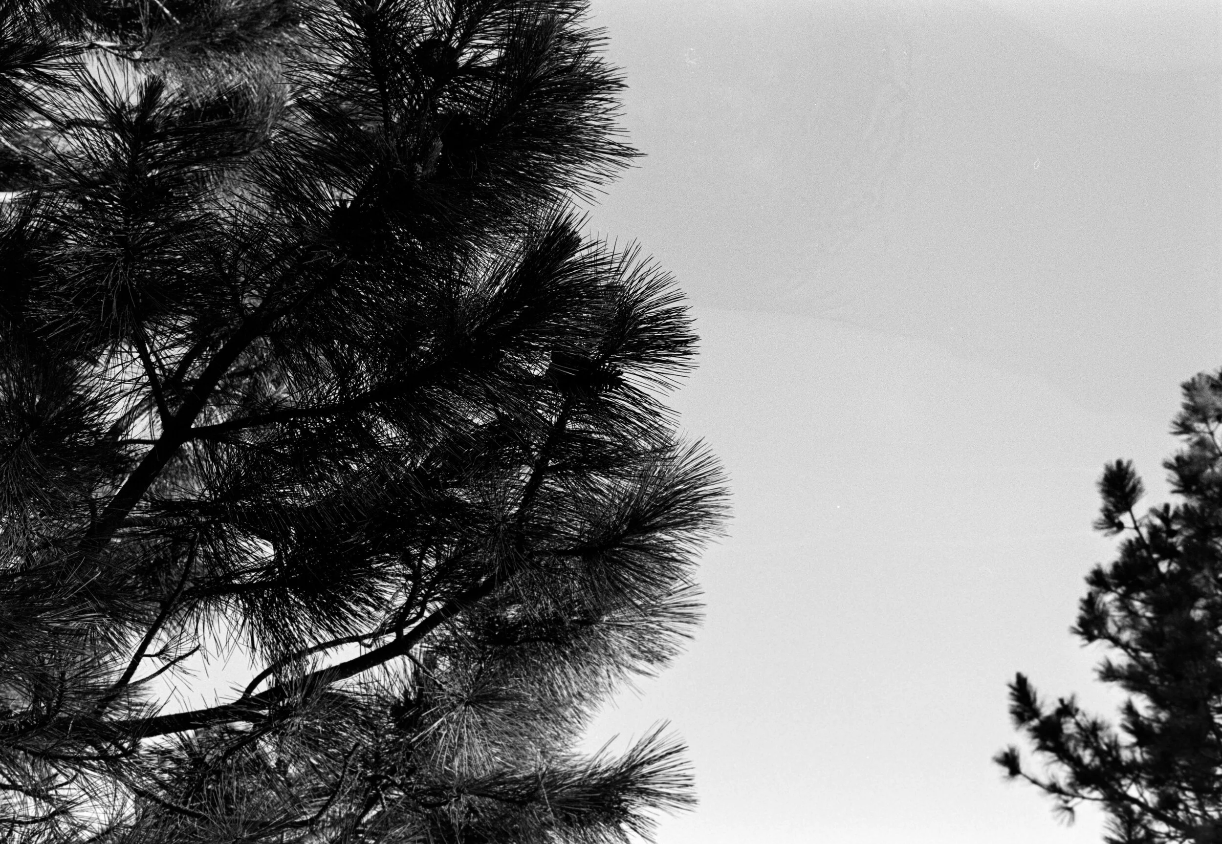
Ilford Pan 400
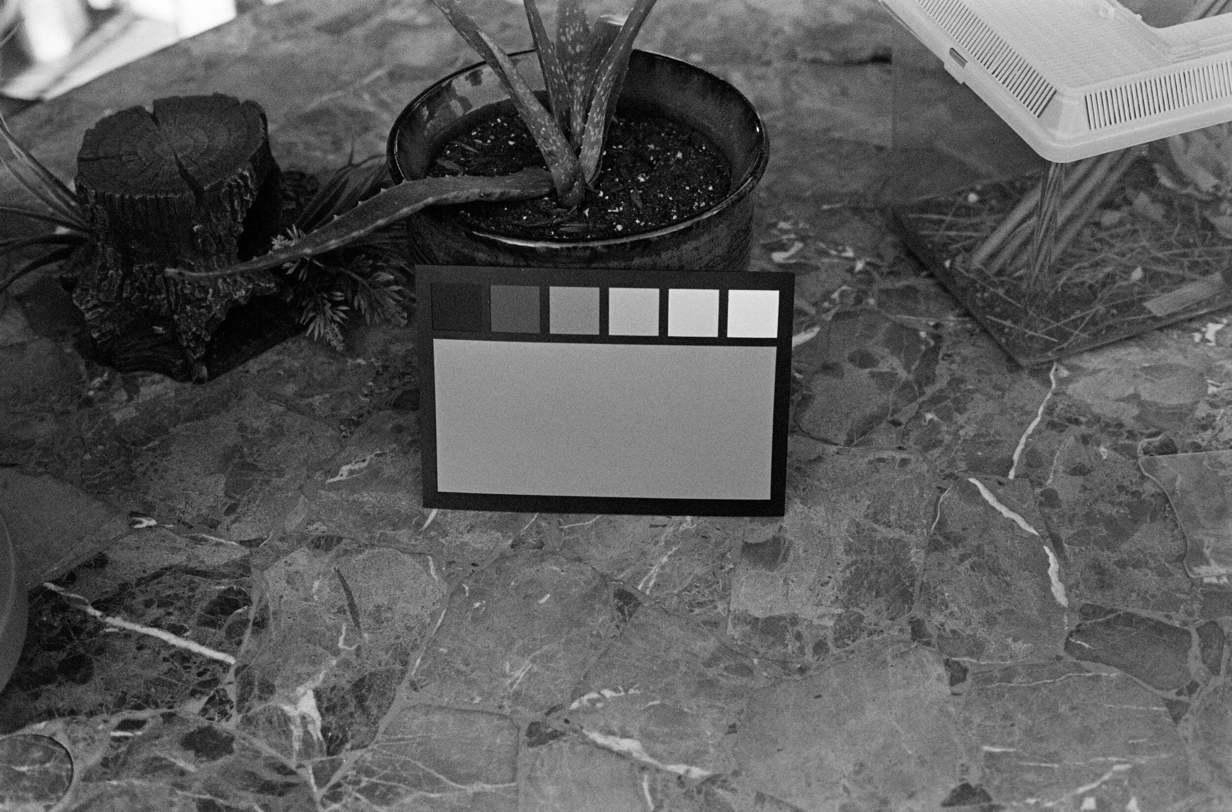
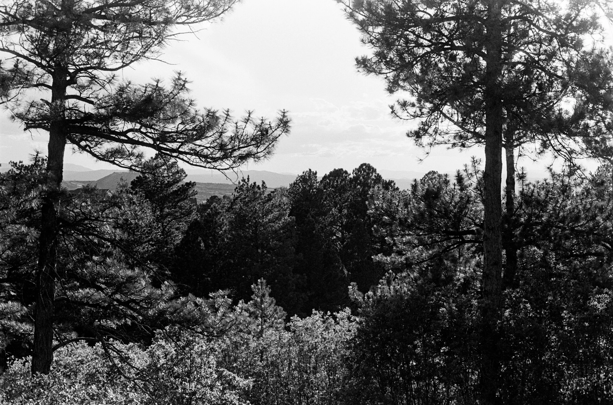
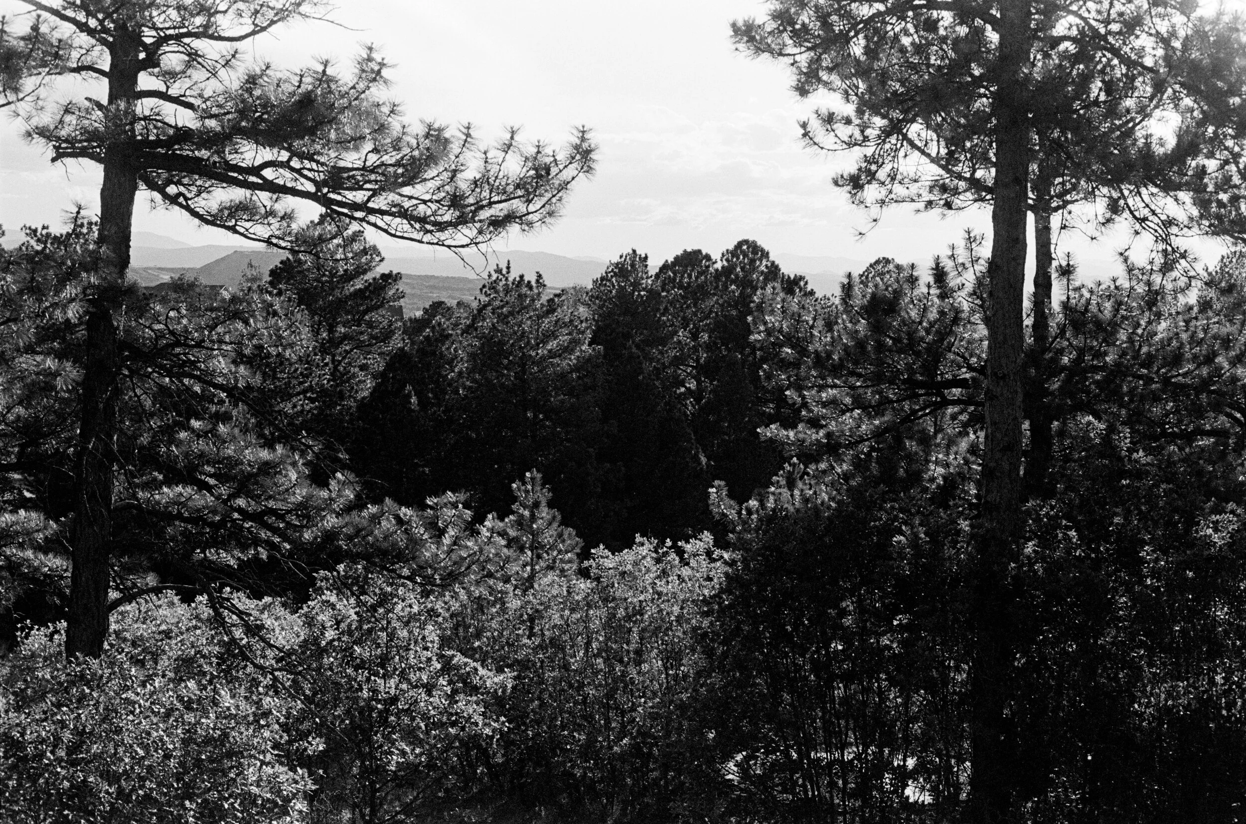
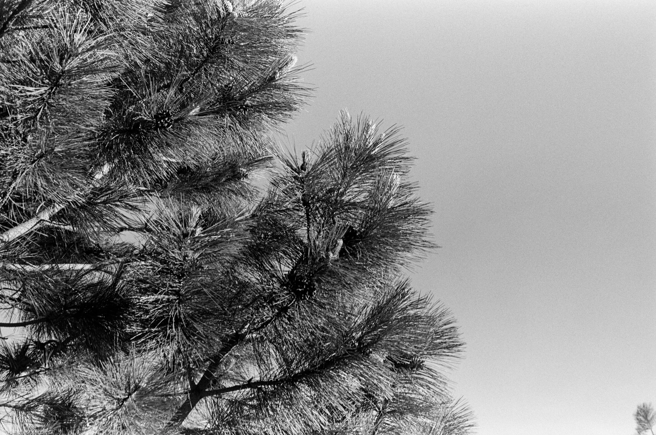
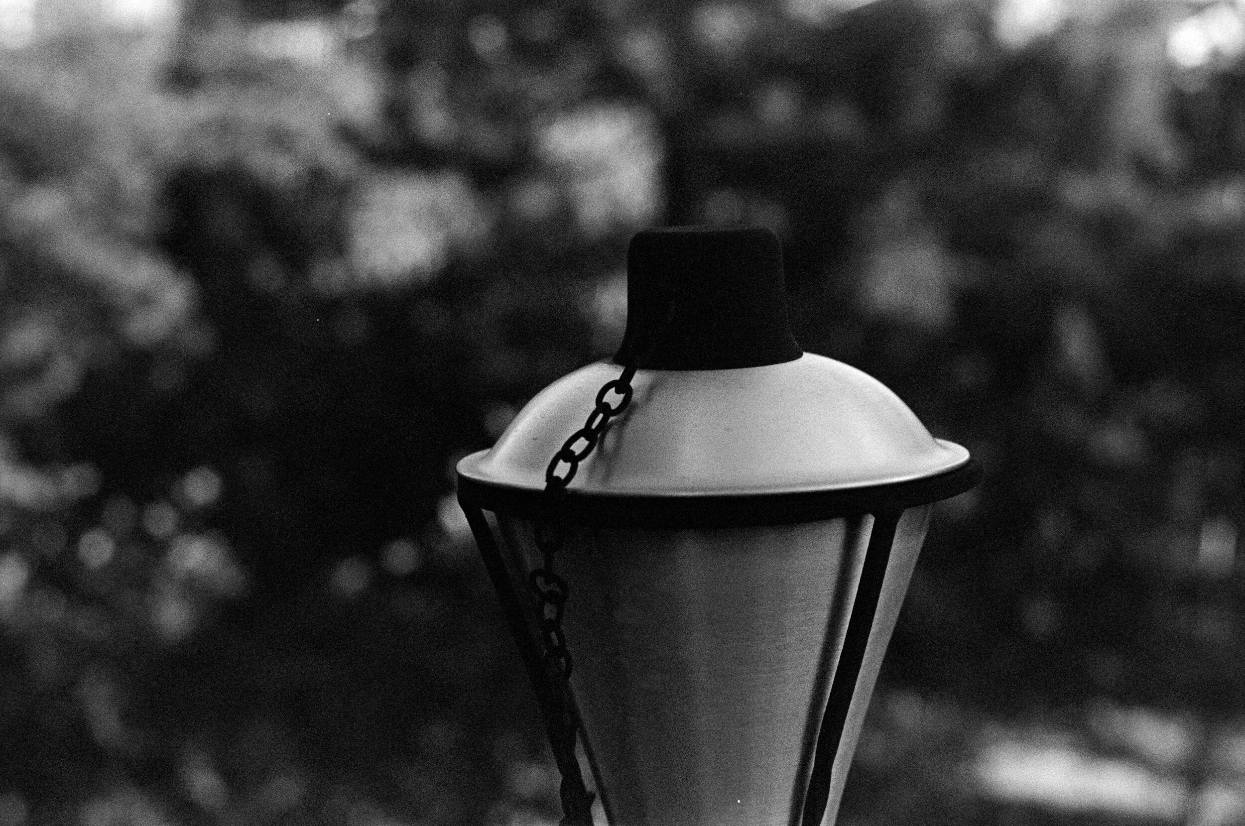
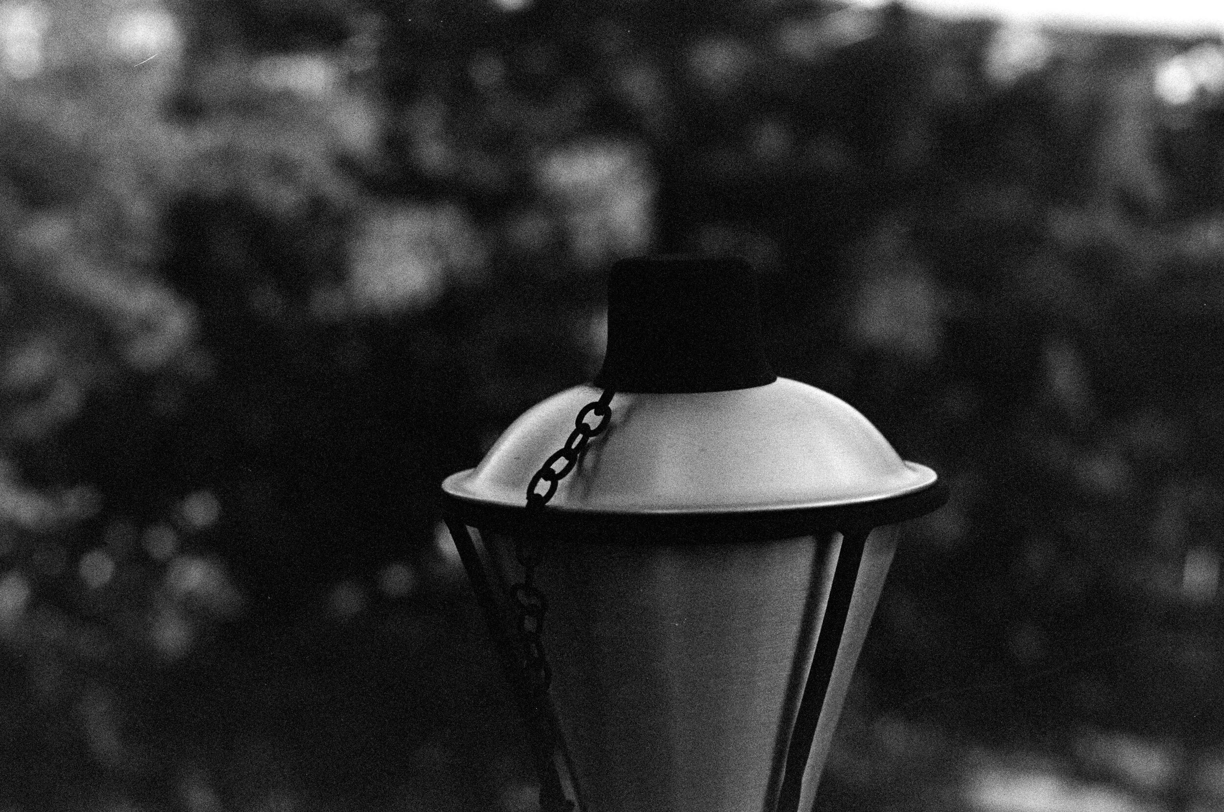
T-Max 400. Results on this were much more linear and restrained. Probably a bit under developed
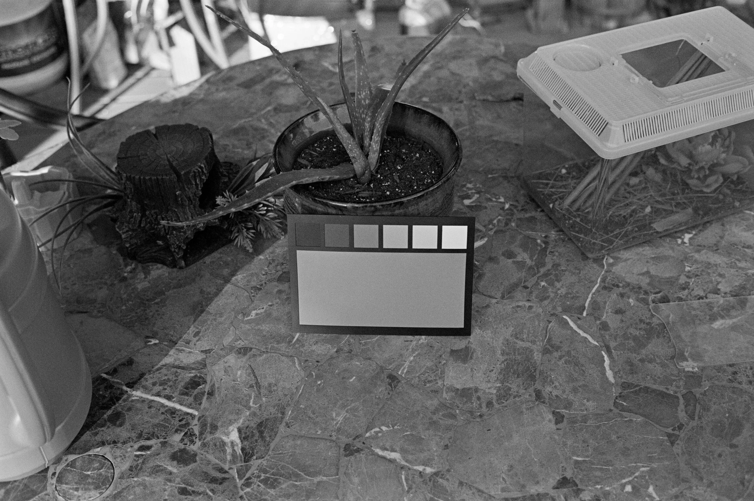
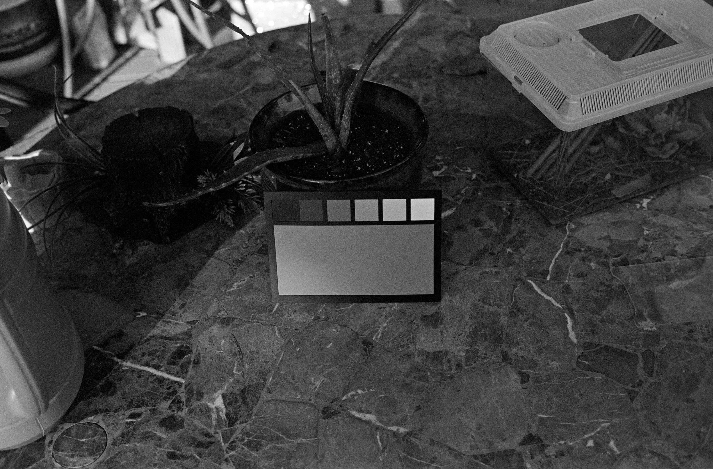
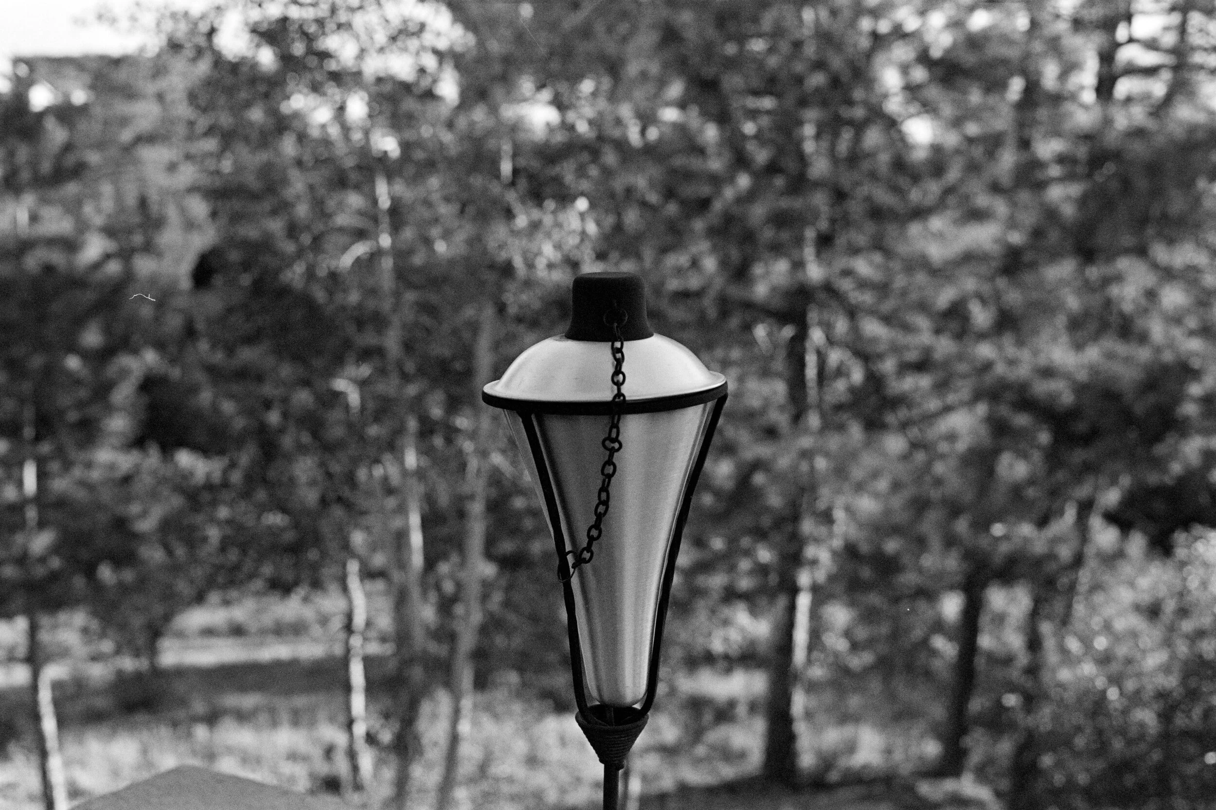

Still a lot more to be done with this, but that’s the progress so far. I’ve also done a little bit of testing with actually printing these negatives on Ilford MGV RC paper. This paper is unlike most papers in that highlight contrast at all grades is fairly high. The top image is from an FP4+ print of EXG3 printed at grade 0, while the bottom image is from an FP4+ print of EXG2 printed at grade 2. Both were basically aimed at just getting everything onto the paper, while also having subtle bright skies and a good black level in the trees. The difference in contrast is quite interesting and instructive though. Make sure to look closely at the shadows in the trees on the top print compared to the bottom print.