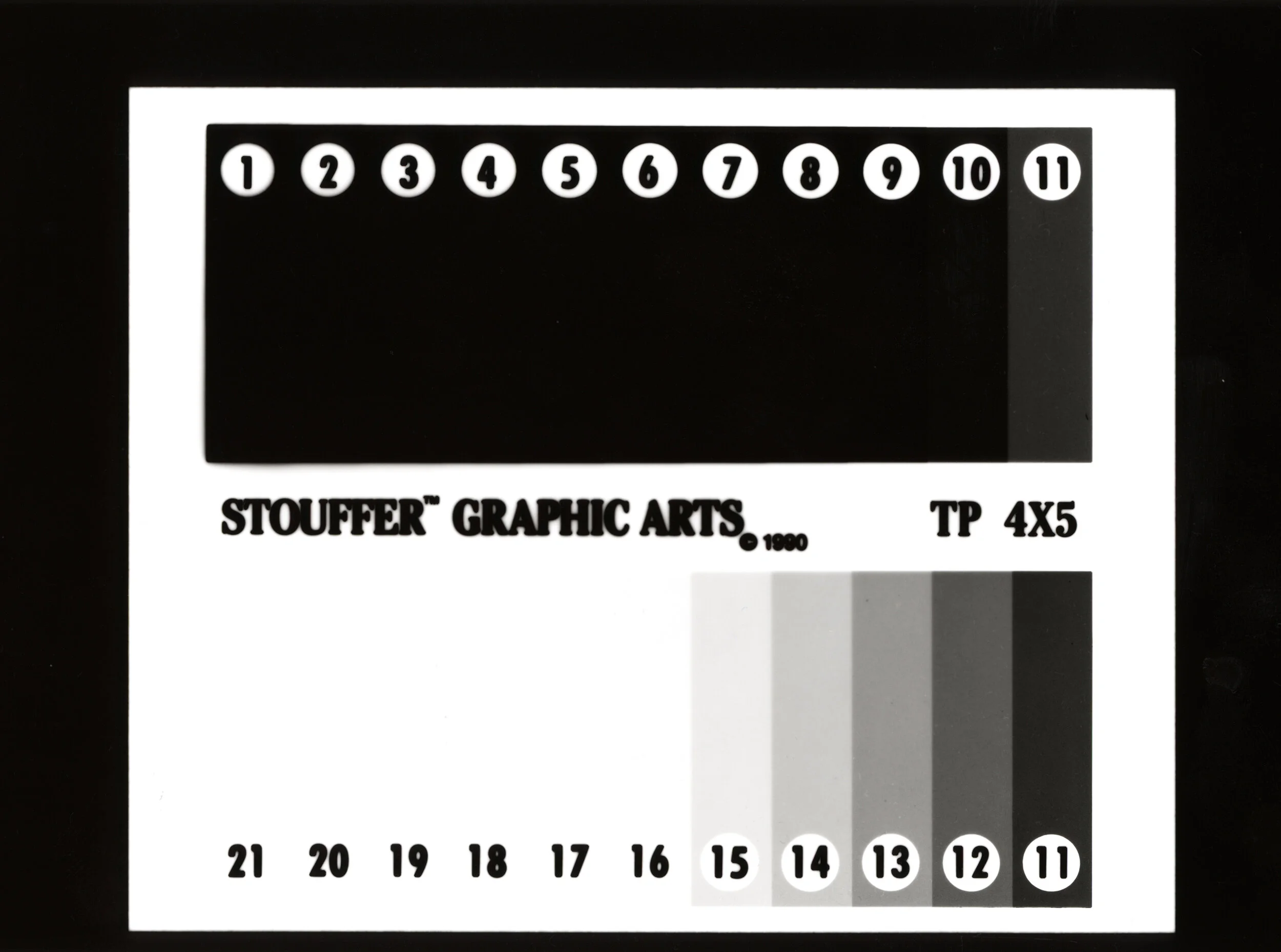
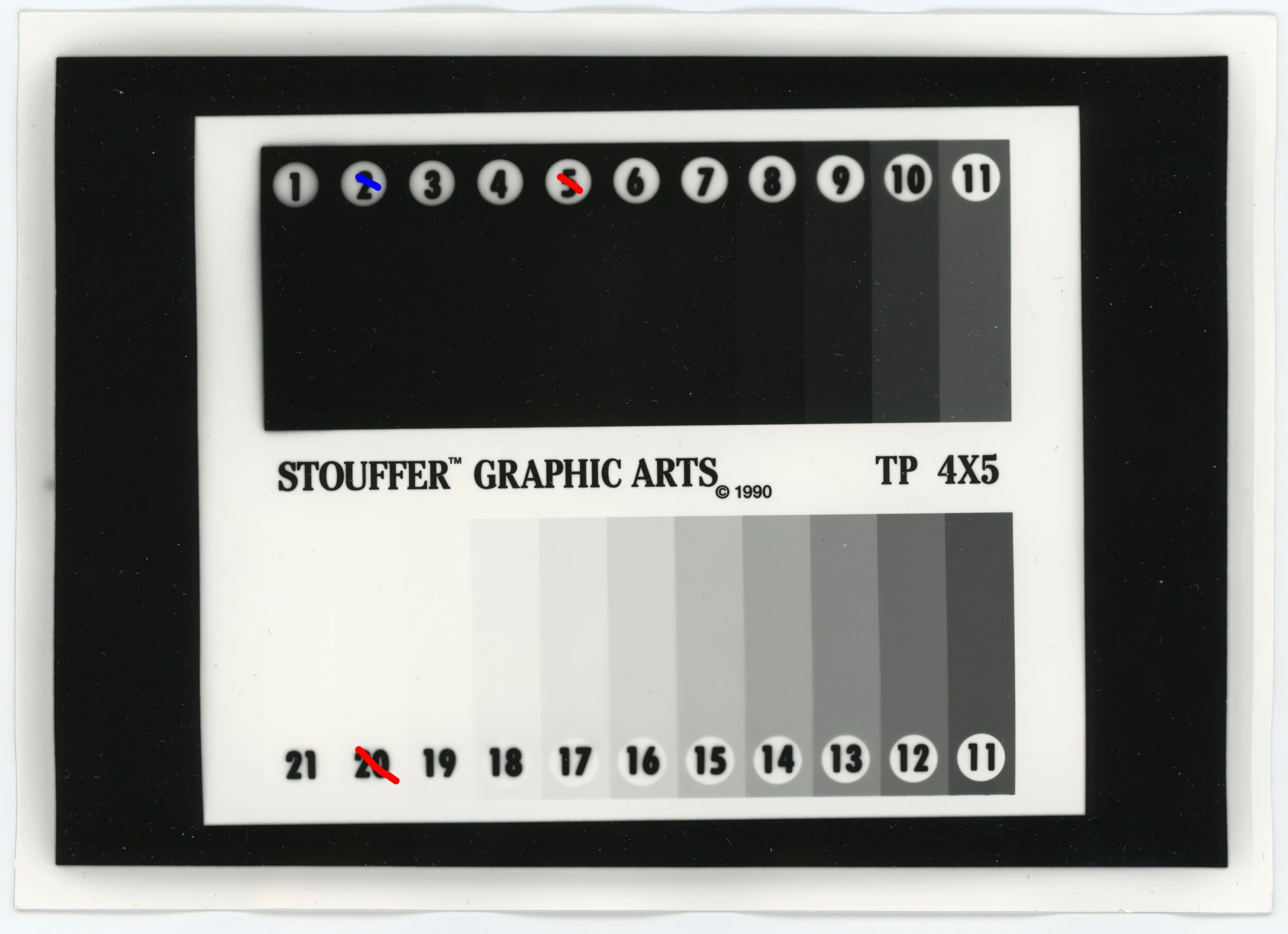
I felt like I was going crazy trying to subjectively judge prints, so I decided to do a massive run of “control” tests using nearly every 5x7 paper I own with a 4x5 step-wedge and processing in Liquidol 1+9 for 1m30s. A water stop bath was used and fresh TF-4 fixer, fixed for either 30s or 1m depending on paper type. This is the results for each paper type. Each paper type, unless “double exposure” was printed for 10s at a consistent enlarger height, at f/5.6 with a 6x6 mask and 80mm lens. Double exposure was simply printed for 20s instead. The step-wedge was in 0.15 stop increments. The “range” of each paper is with the lowest number being absolute black with no visible difference in lower values, while the top number is absolute white with no visible difference in higher values. I did not measure any of these for density, this is based solely on visual inspection. Each paper was rinsed before development. In initial tests I saw no difference between rinsing and not, but after drying, the test sample (Ilford Warmtone RC) had a visibly lighter step 7 and visibly darker step 8 when not rinsed Otherwise tonality and range was identical. I’ll eventually do a test run without rinsing, but I do rinsing most of the time with developer experiments to remove incorporated developers from the equation, so it’s still useful for me. Enlarger used has a lower contrast diffusion style light source.
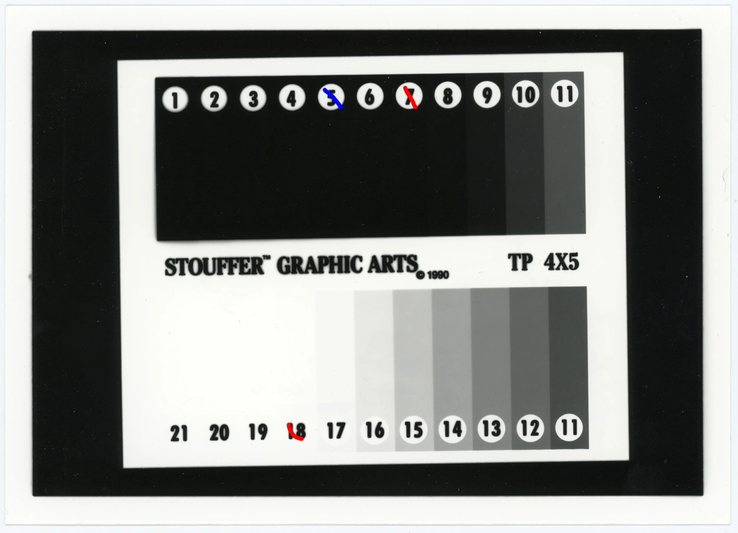
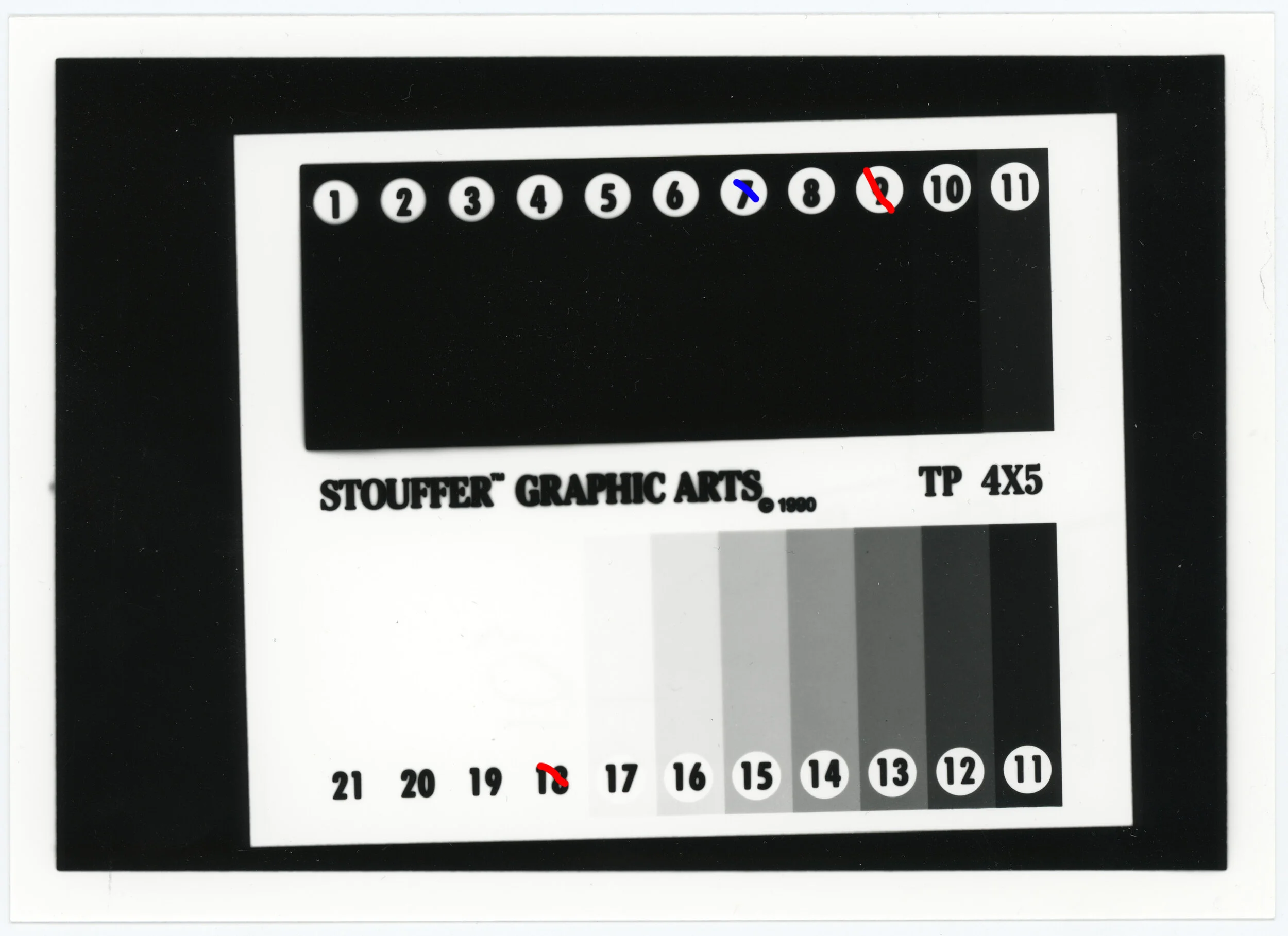
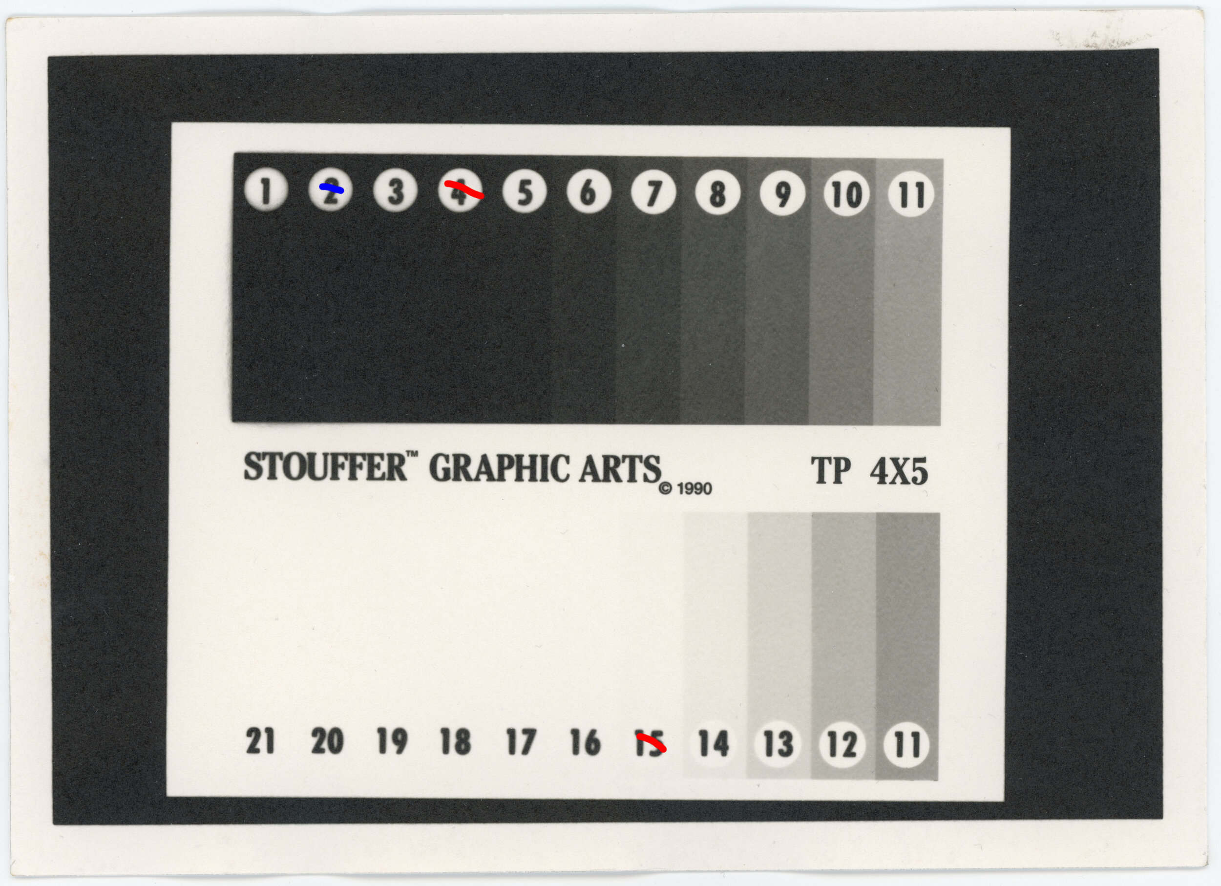
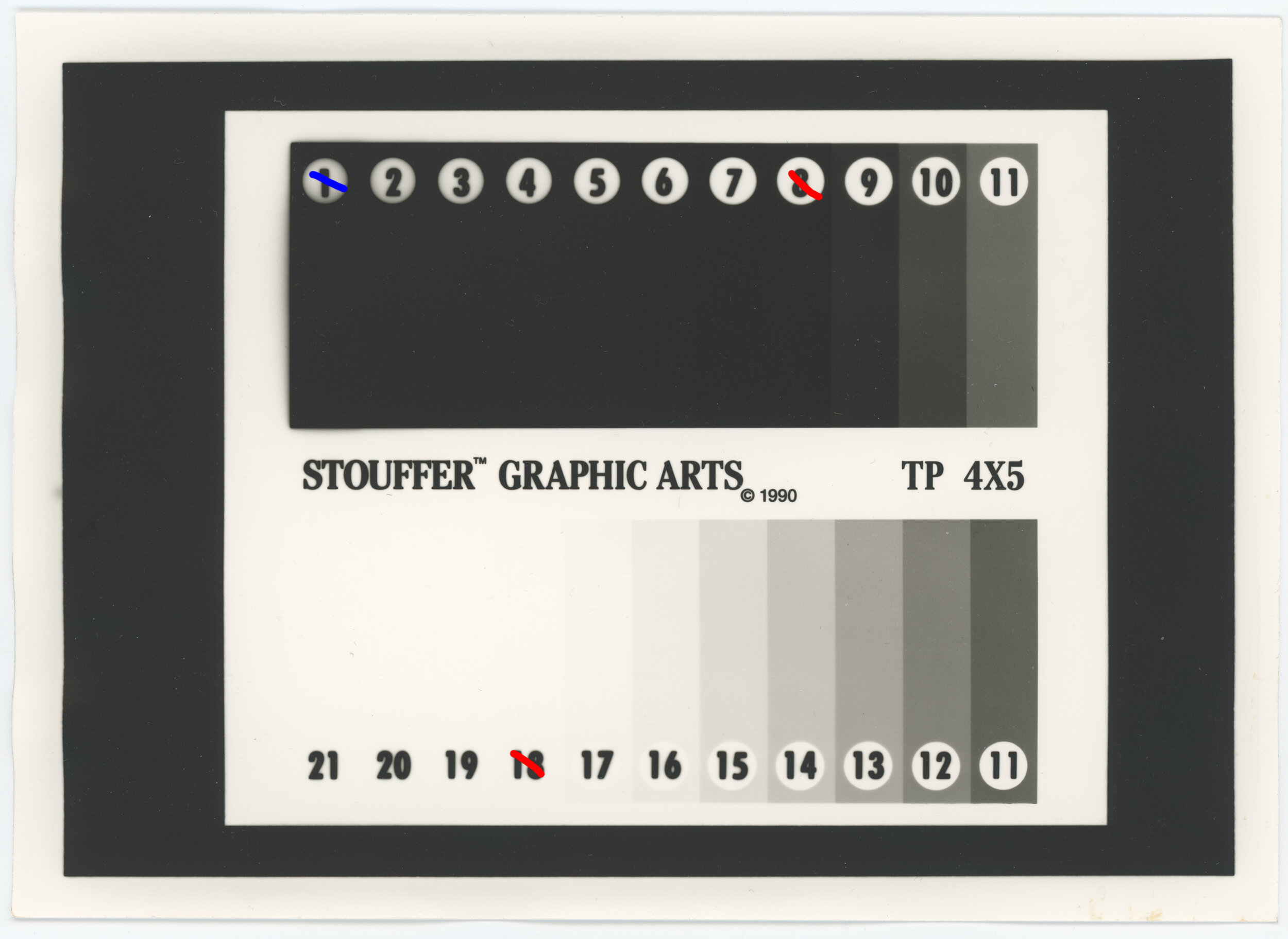
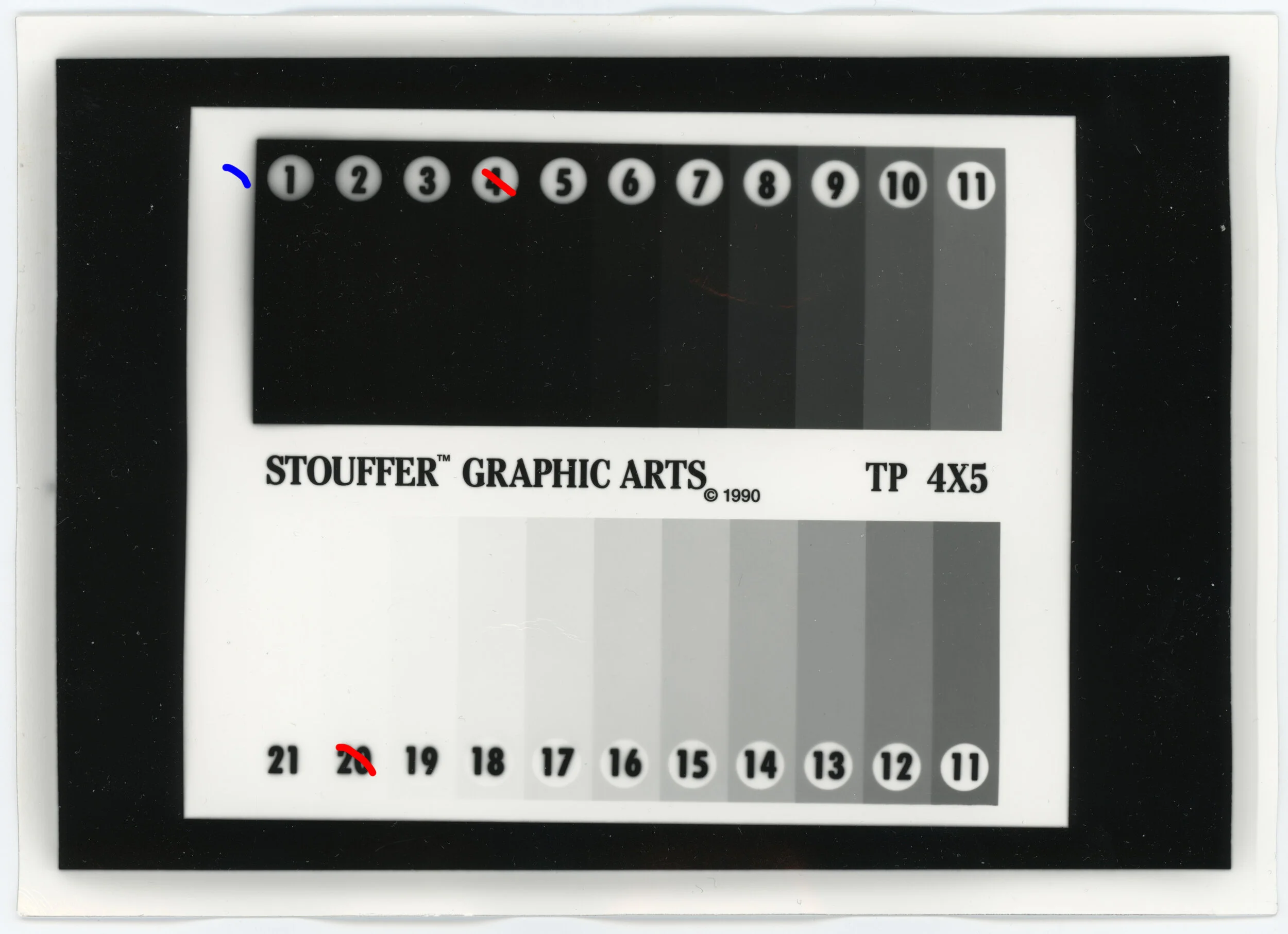
Update! I now include scans of these prints. Note they aren’t exactly accurate to actual appearance of the prints. Specifically some are much darker in person than they appear in the scan, but I wanted to use consistent settings for all. Scanner was an Epson v600, using IT8 calibrated color reference, black/white curve was set to perfectly flat and post-processed in photoshop to have a black point of 19 and a white point of 252. Due to ridiculous reasons, I lost a few of the prints with these step wedges, so that’s why not all of these include scans. Order is 1st scan is grade 1, 2nd scan is grade 2.5. The red line is where visible differentiation stops in normal viewing. The blue line is where differentiation stops when shining a light through the back of the paper
Ilford Warmtone RC
Grade 1 range: 4 to 16 (12)
Grade 2.5 range: 6 to 16 (10)
Shift difference: Begins to get darker in grade 2.5 at step 9. Step 7 is almost visibly black (can just barely tell 6 is darker) and significantly different from the very dark grey produced at grade 1.
Overall impression: A standard good Ilford paper. In liquidol it looks just barely warm and closer to neutral. Contrast control tends to have a stronger effect on the lower shadows while not touching midtones very much.
Ilford MGV RC
Grade 1 range: 7 to 18 (11)
Grade 2.5 range: 9 to 18 (9)
Shift difference: Begins to get darker in grade 2.5 at step 14, while step 11 in grade 2.5 is “pretty much black” but in grade 1 is just a bit darker than middle grey
Overall impression: Deeper blacks than warmtone RC. Fairly neutral, but just slightly warm, but definitely closer to neutral than Warmtone. Contrast control will be quite dramatic and definitely can require exposure changes. It seems that highlight contrast is mostly fixed at somewhat high and midtones and shadows are what are mostly changed by contrast control, and of course how much will clip to black.
Ilford ART300 FB
Grade 1 range: 5 to 16 (11)
Grade 2.5 range: 7 to 15 (8)
Shift difference: Begins to darken significantly at step 9 in grade 2.5.
Overall impression: Due to the unique surface, blacks are definitely not going to be extremely striking and deep, but they are quite nice. I’m honestly not sure what I’d use this for. It seems to have mostly fixed contrast for midtones and highlights, but contrast grades control how quickly shadows darken and clip to black.
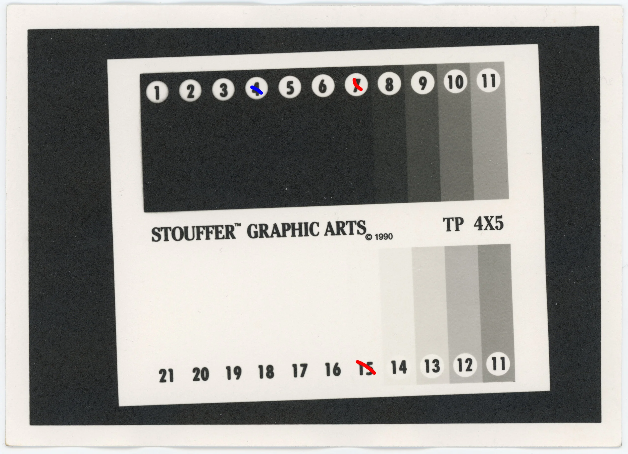
Fomaspeed 311 RC
Grade 1 range: 7 to 19, step 18 is very faint (12)
Grade 2.5 range: 9 to 19, step 18 is very faint (10)
Shift difference: Grade 2.5 begins to get darker at step 13 and step 11 is rather different turning from a dark grey at grade 1 to almost black with grade 2.5
Overall impression: Compared to Ilford papers, has less shadow separation, but more highlight separation. Somewhat warmer than Ilford warmtone RC, especially in shadows. Blacks look somewhat “plasticy”. Would probably be well suited for high key subjects, especially when more shadow contrast is desired.
Fomatone 133 FB (double exposure)
Grade 1 range: 6 to 18 (12)
Grade 2.5 range: 8 to 18 (10)
Shift difference: Grade 2.5 gets darker at step 13. Similar to 311 RC, the contrast shift point is rather high in the total range. The overall darkening of lower values is linear with no point where things really seem to accelerate like with 311 RC.
Overall impression: Overall neutral tone with a bit of olive toning in the darker grays. Blacks here are nothing special, but the surface is a semi-matte. Like the 311 RC this would be great for higher key subjects, but more shadow separation is available here
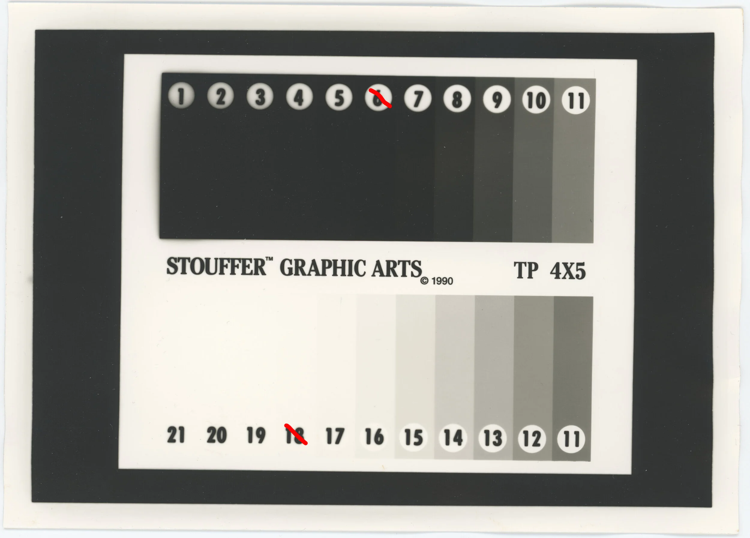
Fomatone Classic MG (double exposure)
Grade 1 range: 6 to 16 (10)
Grade 2.5 range: not measured
Shift difference: not measured
Overall impression: Distinctly warm toned, with slightly brown middle greys with some olive tint in the darker values. Definitely darker blacks than 133 FB and somewhat rougher surface despite them both being semi-matte. This paper has better shadow separation, but worse highlight separation compared to 133 FB at grade 1.
Arista.EDU Ultra FB
Grade 1 range: not measured
Grade 2.5 range: 10 to 20 (10)
Shift difference: not measured
Overall impression: Unfortunately my box of this is somewhat fogged (only affecting border), but in my various tests with this paper, the black levels is what has astounded me, despite it being a matte finish. It reminds me of like the “black 2.0” kind of matte black where it looks almost like an emptyness. Definitely unique for matte FB paper at this price. Seems to have better highlight separation than shadows, but need the other contrast grade test to really say for sure.
Adox MCC110
Grade 1 range: 4 to 20 (16)
Grade 2.5 range: 6 to 20 (14)
Shift difference: Grade 2.5 gets darker at 11. Overall seems like the darkening of lower values is quite linear, just spreading the shadow exposures into more “buckets” of tones
Overall impression: Slightly cool tone and with good smooth blacks (gloss finish). The dynamic range of this paper actually surprised me quite a bit. I’d say this paper could be great for anything, but it’s full potential is with longer scale negatives that might be difficult to properly print on other papers. It could also be good for use as paper negatives. The contrast control seems to mostly affect everything just below middle grey and there is great highlight separation otherwise. Note that I developed this paper for 2m instead of 1m30s. It was extremely slow for an image to come up and it had just seemed to look black at 1m30s so I gave it extra time.
In the future with new developers I’ll make use of the prints I made here to evaluate the actual performance of a developer without it being 100% subjective. These control sheets were boring to make, but should make things a lot simpler for judging speed, contrast, and tonality differences in new developers. I also might update this list later on with more paper types, though right now I have no need for more paper.